
Co-Authored by Excel Dictionary's Emma Chieppor
Excel can be so frustrating, especially for you Small Business Owners. You’re building, you’re hiring, you’re selling, you’re working around the clock—the last thing you have time for is learning spreadsheets.
That’s where I come in! I’m Emma Chieppor, creator of Excel Dictionary, your ultimate source for impactful, digestible Excel tips and tricks. I’ve taught over 6 million social followers how to make Excel a whole lot easier—now I’m partnering with Paysafe to create a special 3-part series specifically for Small Business Owners!
Over the coming weeks, I’ll share how-to articles all about getting you the fundamentals of Excel. Wanna learn through video? Come on over to my TikTok and Instagram for even more!
Today’s lesson teaches you how to create one my favorite ways for tracking progress and visualizing results: an Actual vs. Target chart. We’ll even use AI to make a few charts, visualizing data faster and easier than you ever thought possible!
Actual vs. Target Chart
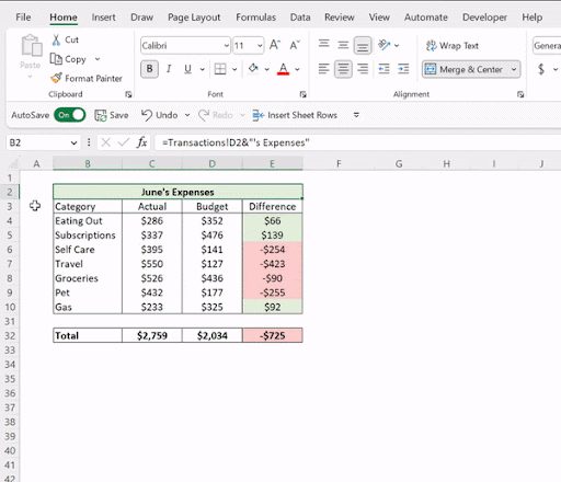
First, let’s take a look at how to create my favorite chart: an Actual vs. Target chart. When projecting data and setting budgets for your small business, it’s so important to track progress toward your goals so you can make any adjustments needed to get back on track. Actual vs. Target Charts track and visualize your progress to your targeted amount.

To create an Actual vs. Target chart, select the data, go to the Insert tab, open the Combo Chart dropdown, and select Clustered Column - Line. Now that we’ve created the chart, I like to quickly clean it up by deleting the title and gridlines.
Next, we must reformat the target data series from a line into built in dashes. To do this, right-click the line within the chart, select Format Data Series, and press the Fill & Line icon in the Format Data Series window. From here, select the Line icon and select ‘No Line’ under the line dropdown to remove the target data series line.
Now we are just left with the data points and we need to format them as built-in dashes. To do this, select the Marker icon, open the Marker Options dropdown, and select built-in to format the data points as icons. To update the data points icons to dashes, select the dash icon under the ‘Type’ dropdown. Last but not least, adjust the size of the dashes so that they are proportionate to the data bars using the size box.
Visualizing Data With AI
Now that we’ve learned how to create an Actual vs. Target chart, I want to introduce you to Excel’s most powerful tool for summarizing and visualizing data: The Analyze Data tool.
Visualizing data can be an overwhelming task if you don’t know where to begin. As a small business owner with an endless list of ‘To Dos,’ learning how to create Excel charts doesn’t need to be added to the list. Luckily it doesn’t have to be - thanks to the Analyze Data tool.
This tool analyzes your data using AI and creates a selection of high-level visual summaries that can be inserted directly into any worksheet. All you have to do is select any cell within the data, press Analyze Data on the Home tab, and insert any of the visuals directly into your worksheet!
Now, let’s say you needed a specific chart of your data but didn’t see it in the Analyze Data window. Instead of resorting to manually creating the chart, you can actually tell Analyze Data to create the chart and it will create it for you! Just select the text box at the top of the Analyze Data window, type in how you want to visualize your data, and Analyze Data will generate the chart for you in just a few seconds.
Visualizing your data will help you more deeply understand your business metrics. Use these insights to make data-driven decisions and take your business to the next level!


