
Co-Authored by Excel Dictionary's Emma Chieppor
Welcome back to the second edition of my three-part series with Paysafe: Excel Tips For Small Business Owners. I’m Emma Chieppor, creator of Excel Dictionary, your ultimate source for impactful, digestible Excel tips and tricks. I created Excel Dictionary to help others avoid Excel overwhelm and to be the coworker that you can turn to when you need help; the coworker I wish I'd had when I first started my career.
Now that we've learned to visualize our data using Excel charts (check out the last edition!), let's learn how to create powerful dashboards to display the charts you create. As a small business owner, being able to create dashboards displaying valuable insights in Excel will help you and your key stakeholders understand your metrics.
In this edition, I’m going to show you how to turn your basic worksheets into professional dashboards in just five simple steps. Yup, you heard that right, five simple steps!
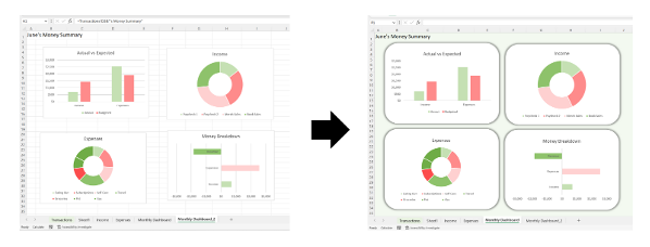
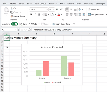
Before we start, you need to add the charts you want to include in your dashboard into a worksheet. If you are unsure how to create a chart or need some chart inspo, check out edition 1 of this series. Once you’ve added charts into your worksheet, it’s time to design the dashboard using the 5 step method I put together.
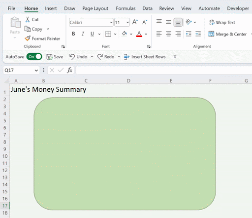
Step 1: Select a background color
First, we need to select a background color for the dashboard to make the charts pop. To do this, select the entire worksheet by clicking the top left corner of the header, open the fill dropdown on the Home tab, and select any color you want.
Step 2: Insert a shape
Next, we need to insert a shape to place each chart in. Using shapes as chart backgrounds allows us to change the shape of the chart and add shape effects to help the chart stand out more. To insert a shape, go to the Insert tab, open the Shape dropdown, and select the shape you want each chart to be. Once you have chosen the shape, insert the shape into your worksheet by clicking and dragging the mouse until the shape is the correct size.
Step 3: Format the shape
Once the shape is inserted, we need to format it by updating the fill color and adding the shape effect! To update the fill color, select the shape, open the Shape Fill dropdown on the Shape Format tab, and select white to match the chart. Next up: adding the shape effect. Adding the shape effect is an essential step to give the chart some dimension within the dashboard. To do this, open the Shape Effects dropdown on the Shape Format tab, select Shadow, and select Offset Center under the Outer section to make the shape pop.
Step 4: Send the shape back
Now that our shape is formatted, we just need to send it to the back position so it’s behind our chart! To send the shape to the back, right-click the shape, and select Send to Back.
Step 5: Format the chart
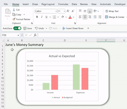
Last but not least, we need to make some minor format tweaks to the chart to make it blend into the shape! First, delete the chart gridlines by selecting them and hitting the delete key. Lastly, we need to remove the chart border by selecting the chart, navigating to the Format tab, opening the Shape Outline dropdown, and selecting No Outline.
Now that we’ve formatted to chart to blend in with the shape, we’ve officially completed all five steps! Now just repeat this process for each chart within the dashboard, make sure everything is aligned, and impress anyone with your small business and your Excel dashboards!


